For the complete documentation index for agents and LLMs, see llms.txt.

Release 2026.4

Check April's updates.

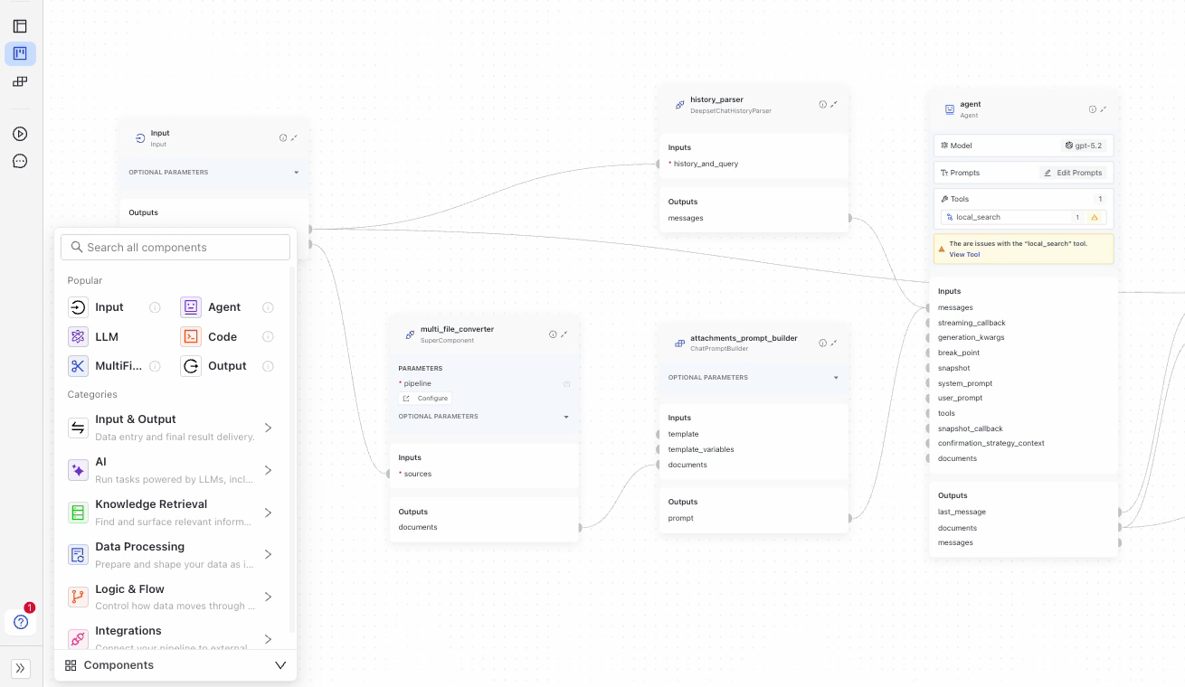
New Component Library

We've redesigned the component library. Components are now organized into groups by their function to make them easier to find and use. The component library itself is only visible in the visual view in Builder and you can expand and collapse it, whatever suits you best.

The component library

The new look is enabled by default, but you can still switch back to the old look in Settings.

New Feature in Command Palette

The command palette just got an upgrade: when you're on the Builder canvas, press CMD + K to search for any component in your pipeline and we'll take you right to it. No more scrolling around to find the right component.

The command palette component search

Reusable Code Components

You can turn a Code component into a saved custom component and reuse it across pipelines. After you write and test your code in Builder, choose Save as Custom Component to store it for your workspace or, with the right permissions, for your whole organization. Saved components show up in the Custom tab in the Component Library, so you and your teammates can drag them into any pipeline like built-in components. Each pipeline gets its own copy of the code, so you can iterate on the saved version without changing pipelines that already use an older copy. You can review and remove saved components from Settings at the workspace or organization level.

The reusable code components

For the full picture on custom components and the Code component workflow, see Custom Components and Add Custom Code.